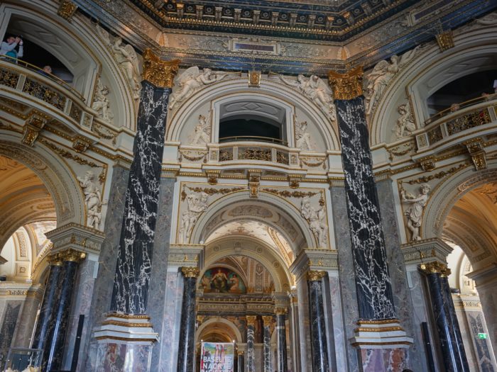
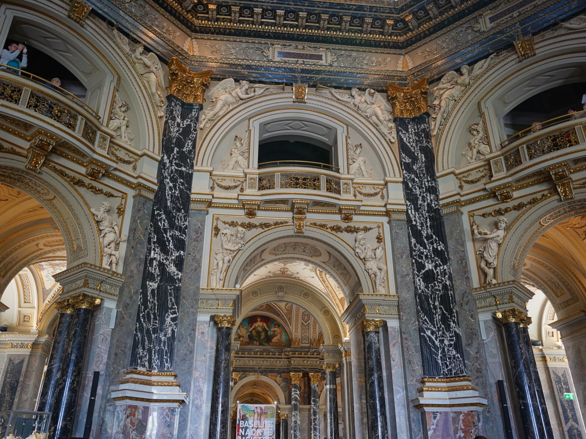
Cafeteria decor
It’s easy to assume as I did that the museum is an old palace repurposed for modern times, like the Louvre or the Belvedere, but it was finished in 1891! Emperor Franz Josef I had the Art History Museum and the Natural History Museum built together with a similar design, facing each other across Maria-Theresien-Platz, as custom-made homes for the Habsburgs’ tremendous art collection and the empire’s no less tremendous collection of natural specimens of all kinds, and to make both accessible to the public.
The style is listed as “Renaissance Revival” which according to Wikipedia is kind of a catch-all term for 19th century architecture that revives and mixes older elements, not just 15th century Italian styles. From what little I’ve seen, Renaissance architecture made more use of different kinds of materials than Gothic, giving a wider variety of colours and textures, and I’m guessing the interior is trying to emulate that.
I’m into it! The museum is absolutely exquisite, the dark marbles and white stucco setting each other off just right, and the relatively subdued (but still extremely intricate) gold accents provide the right amount of glamour and glitz without being overwhelming.

